Redesign & Optimisation
Redesign & Optimisation
Product Tile Redesign
I initiated and led the redesign of Liberty’s product tile and quick buy experience, advocating for a more seamless and consistent shopping journey across the whole site.
Through research, design, and testing, the new design achieved an 11% uplift in conversion and is worth up to £520k in annualised revenue, now implemented across Liberty’s ecommerce platform.
Role
Role
Product Designer
Sole designer on the project
Company
Company
Liberty London
Skills
Skills
End to end design leadership
Data driven UX
System thinking
Interaction & visual design
Stakeholder collaboration
Timeline
Timeline
12 weeks (Jun–Sep 2025)
Problem
On mobile, single column product tiles limited visibility and engagement, leading to higher exit rates and lower conversion. Across devices, the outdated quick buy experience added friction to the shopping journey.

Strategy
I reviewed analytics to understand where drop offs occurred and proposed a two column mobile layout with an improved quick buy overlay to make browsing faster and more intuitive.
I built a business case highlighting the commercial potential of improved product visibility and smoother interactions. This data led proposal helped align the digital trade, digital experience, and development teams around a shared goal, securing prioritisation in the next sprint.
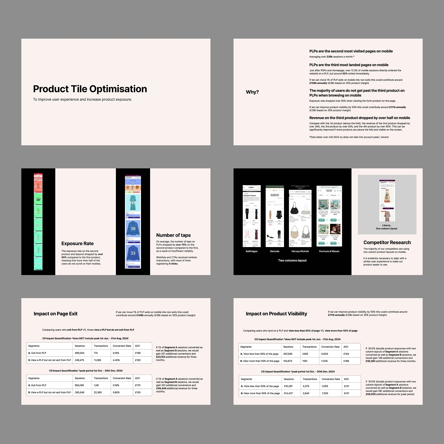
Partial slides from the business case
Partial slides from the business case
Research
I combined analytics, user feedback, and competitor benchmarking to uncover why product tiles underperformed on mobile and desktop and identify opportunities for a more efficient, consistent browsing experience.
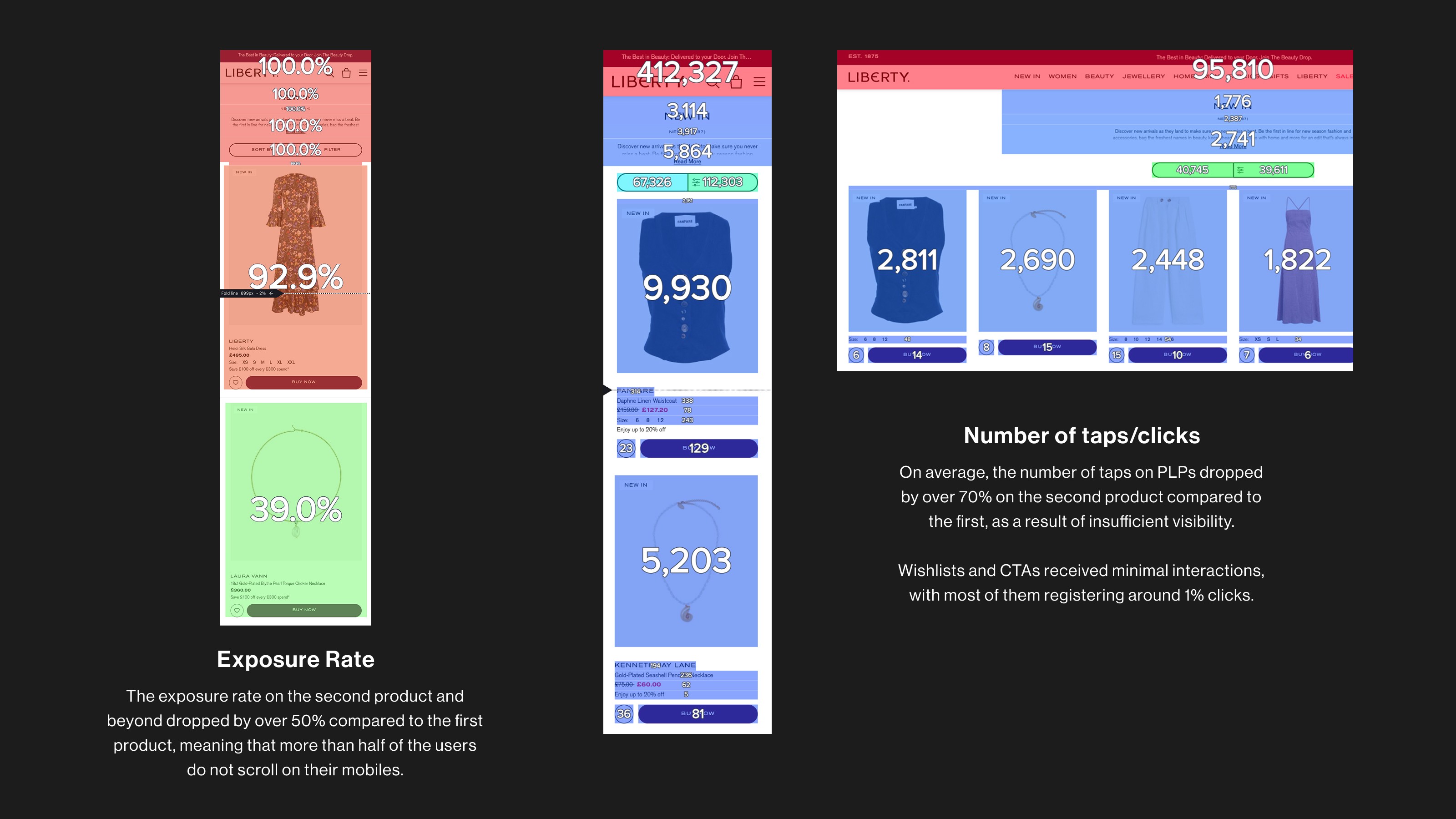
Zoning Analysis
Heatmaps showed that users rarely scrolled beyond the first visible row of products. Low click activity across deeper tiles confirmed visibility as a key issue in mobile browsing.

Product Tile Placement Across the Site
Product tiles appear across multiple touchpoints, from product listing pages to carousels on the homepage, department pages, editorials, and the shopping bag. Mapping these placements clarified the flexibility required for the redesign.

User Feedback
I combined in store interviews with CRM feedback to understand how customers felt about mobile shopping. The main theme was clear: large product tiles made browsing slow, and users wanted a quicker way to see more items at once.
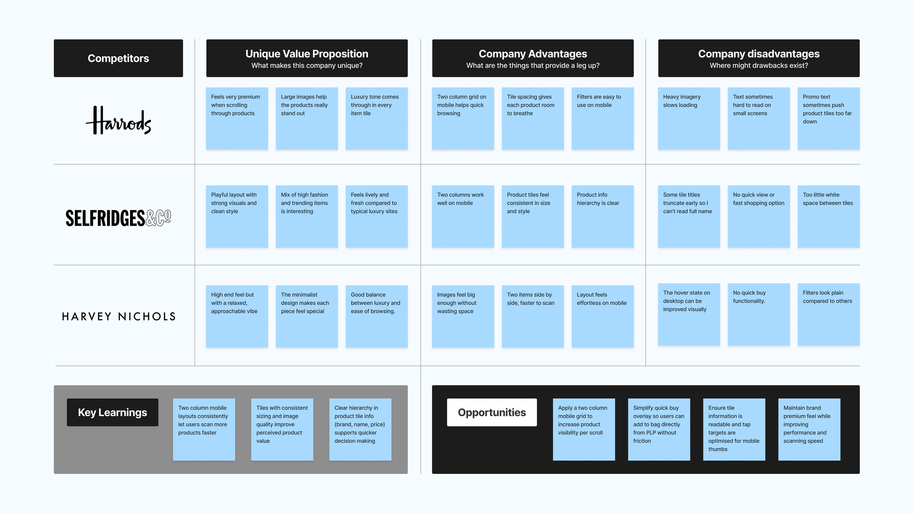
Competitor Analysis
I analysed competitors such as Harrods, Selfridges, and Harvey Nichols. All used two column mobile grids with strong imagery but no quick buy, highlighting an opportunity to improve browsing and usability.
Zoning Analysis
Heatmaps showed that users rarely scrolled beyond the first visible row of products. Low click activity across deeper tiles confirmed visibility as a key issue in mobile browsing.
Product Tile Placement Across the Site
Product tiles appear across multiple touchpoints, from product listing pages to carousels on the homepage, department pages, editorials, and the shopping bag. Mapping these placements clarified the flexibility required for the redesign.
User Feedback
I combined in store interviews with CRM feedback to understand how customers felt about mobile shopping. The main theme was clear: large product tiles made browsing slow, and users wanted a quicker way to see more items at once.
Competitor Analysis
I analysed competitors such as Harrods, Selfridges, and Harvey Nichols. All used two column mobile grids with strong imagery but no quick buy, highlighting an opportunity to improve browsing and usability.
Defining the Challenge
Analysis revealed recurring usability issues around visibility, quick buy flow, and layout consistency, shaping the priorities for redesign.
Pain Points
Product tiles were oversized on mobile, reducing visibility and engagement.
The existing quick buy experience felt outdated and interrupted the shopping journey.
Users struggled to browse efficiently, often not scrolling beyond the first few products.
Design Direction & Goal
The findings guided three goals: improve product visibility on mobile, refine the quick buy flow, and ensure consistency across placements. I explored multiple directions and ran an MVT test to identify which design best met user and business needs.
Process
I translated user insights into wireframes, refined the visual design, ensured responsiveness across devices, and worked with developers to deliver a reusable, scalable template.
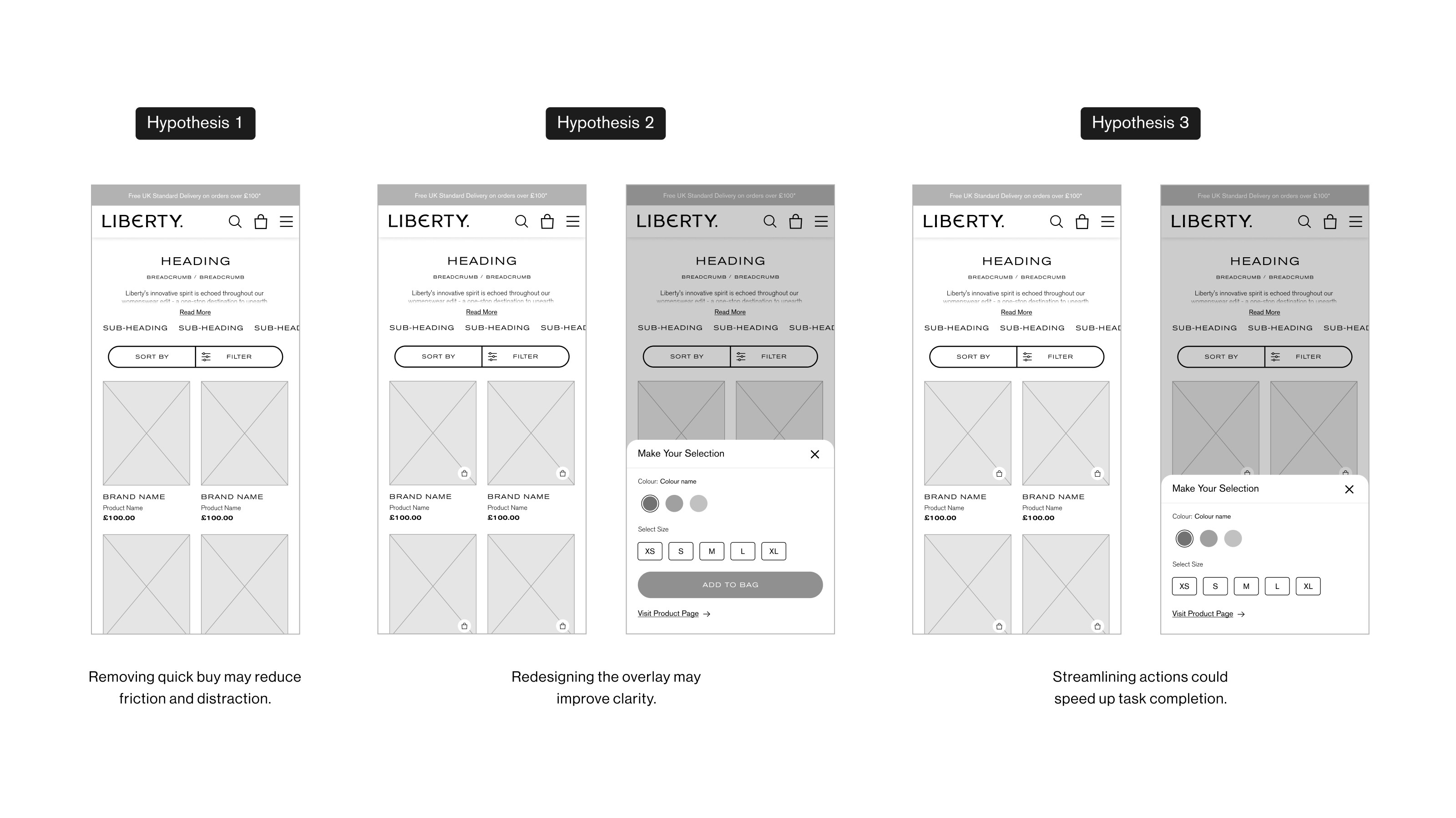
Design Hypotheses
Based on research insights, I defined three hypotheses to explore how different experiences could improve usability and engagement. Each used a two column mobile layout and addressed a distinct pain point.

Test Setup & Variations
To validate the hypotheses, I ran an MVT test with three variations against the control design. Traffic was split evenly to measure how layout and quick buy changes affected engagement and conversion.
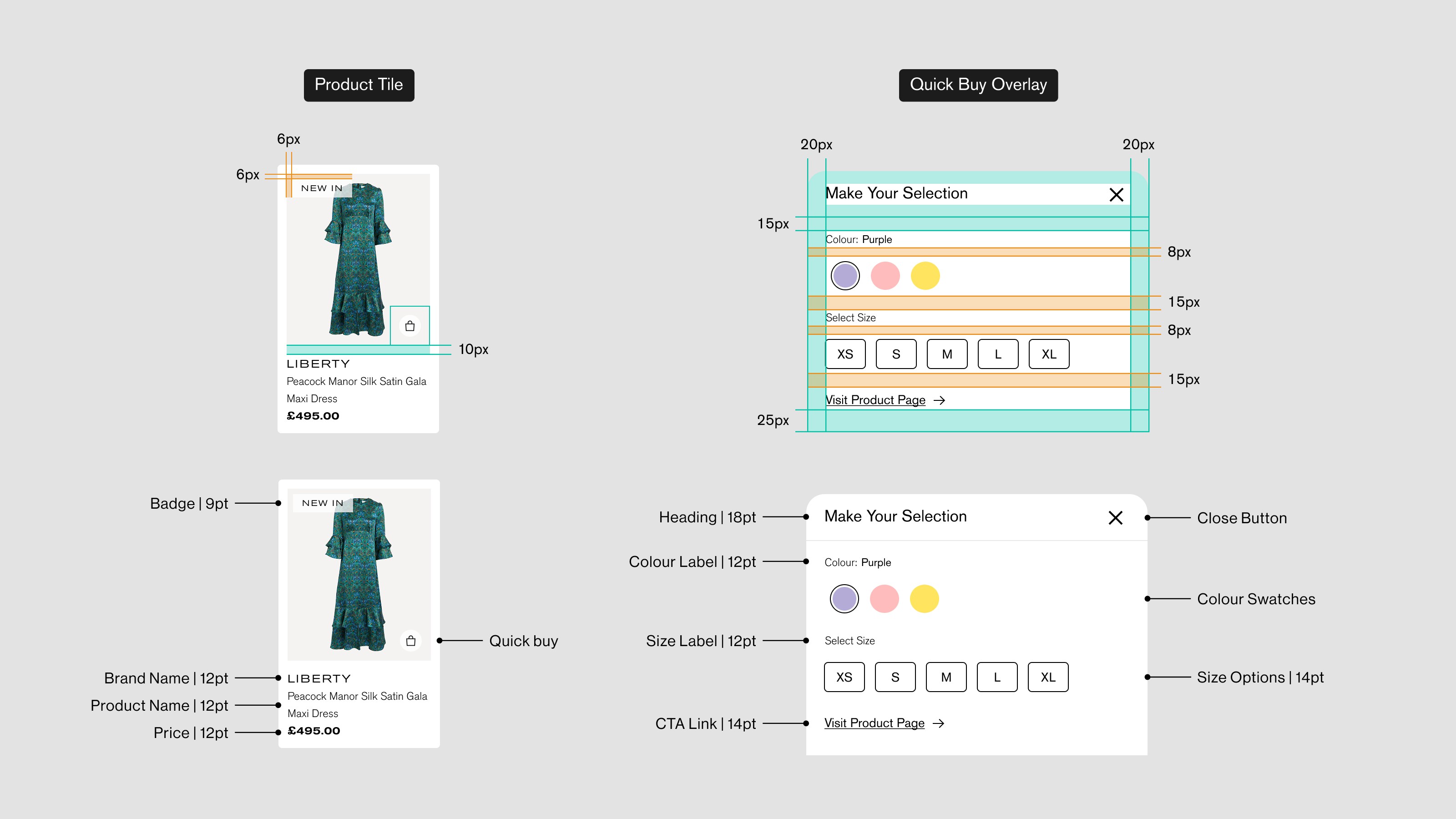
Component Structure
I refined the product tile and quick buy overlay into modular components with consistent spacing, typography, and hierarchy, adjusting layouts for the new two column mobile design.
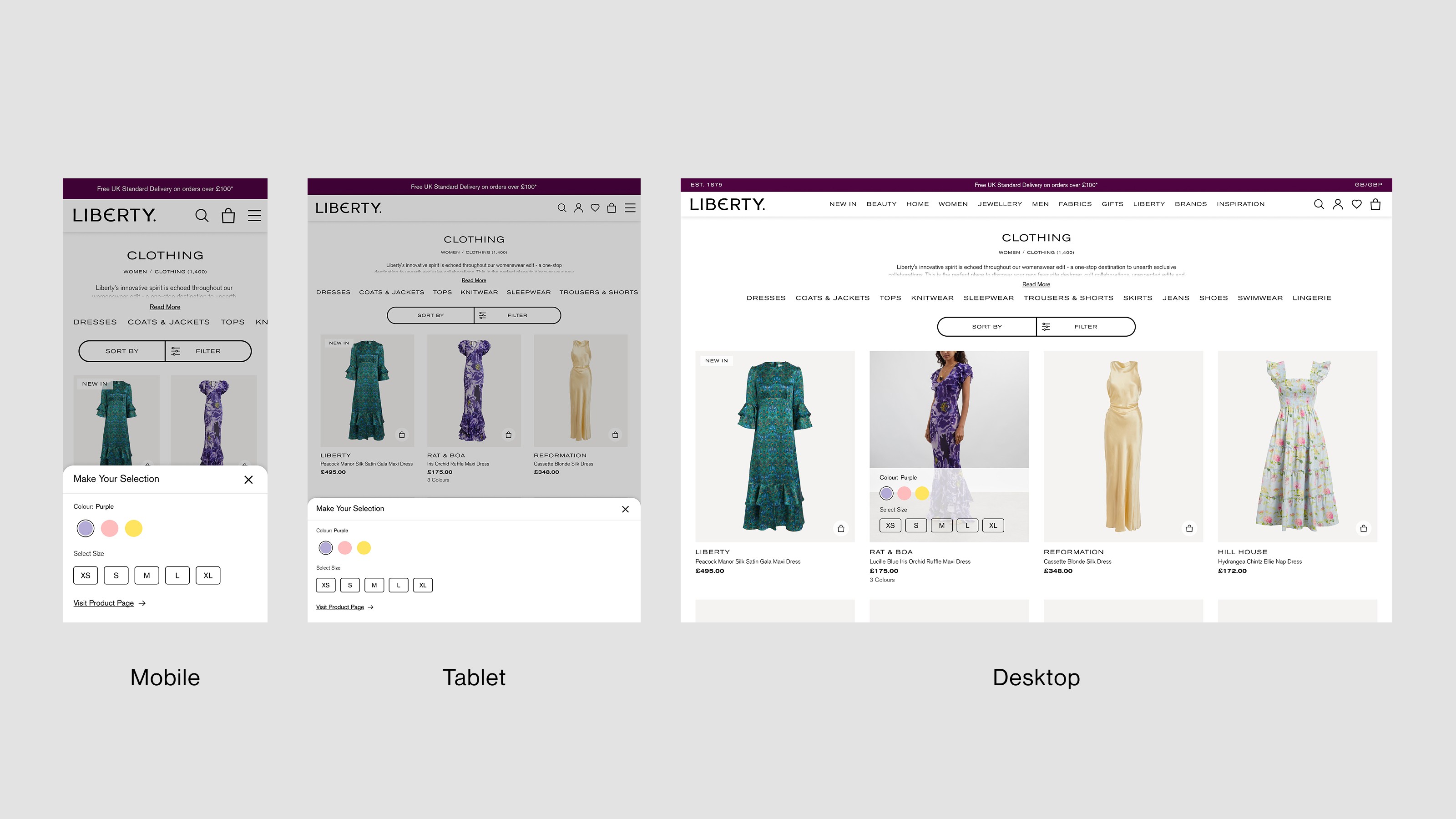
Overlay Design
The quick buy overlay adapts to each device. On mobile and tablet, it slides up from the bottom for easy reach. On desktop, it opens from the bottom of the product image to keep the grid visible and context clear.
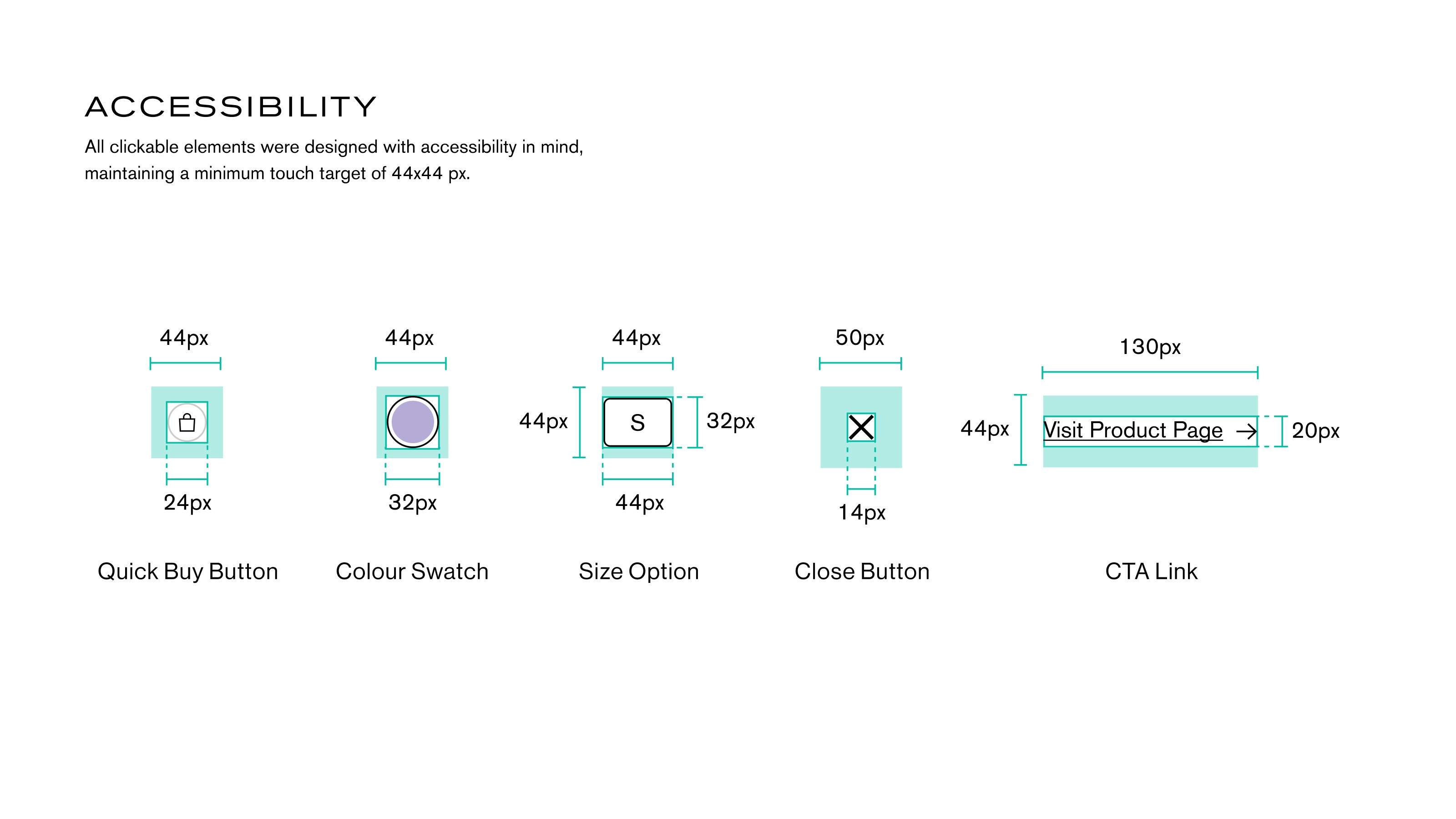
Accessibility
Accessibility guided every interaction, with all clickable elements meeting a minimum 44×44 px touch target. Buttons, swatches, and links were optimised for mobile comfort and clear visual feedback.
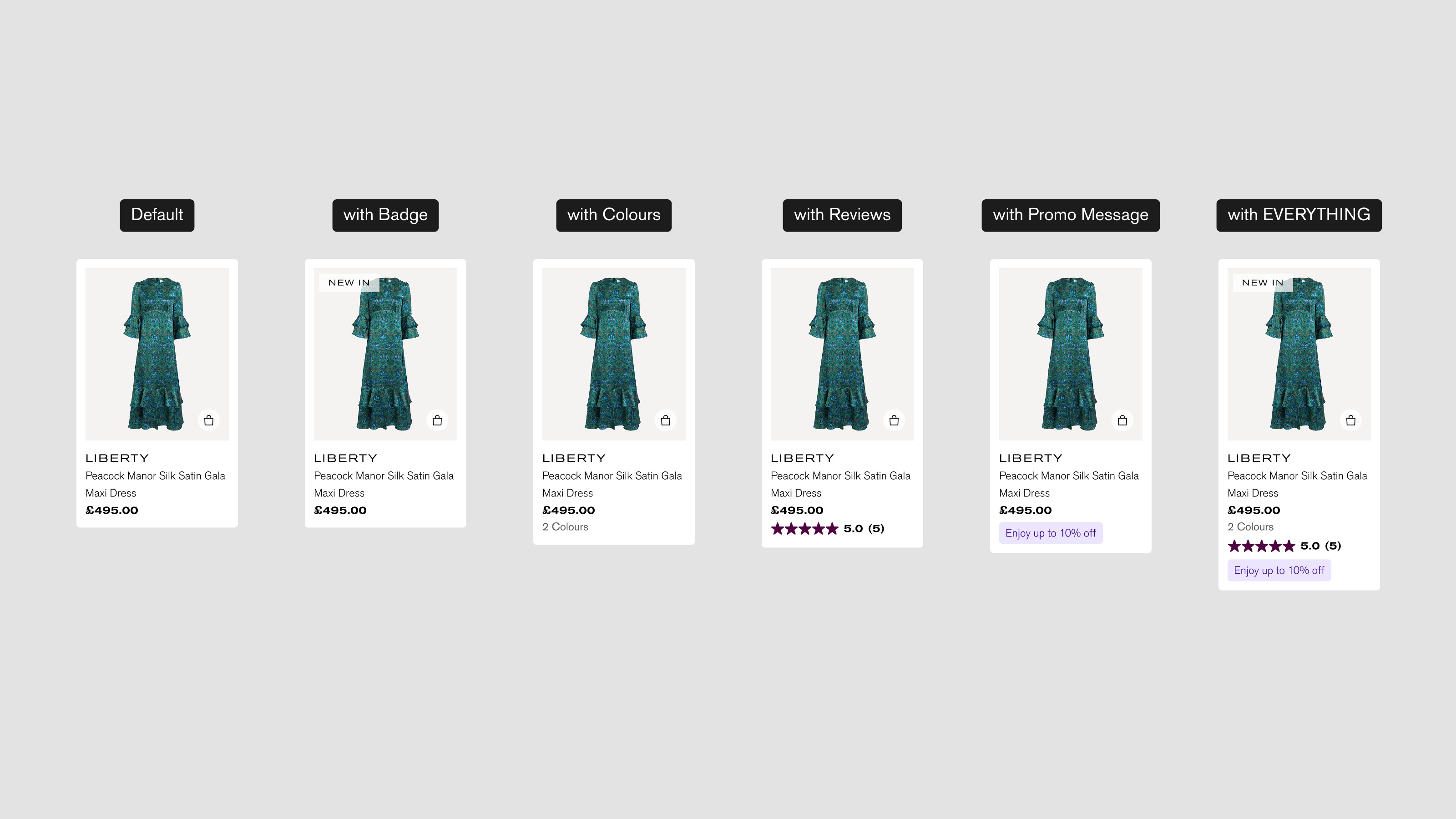
Tile States & Scalability
I designed flexible tile states to handle various content types like badges, colours, reviews, and promotions. The layout adapted seamlessly while preserving hierarchy and consistency across all products.
Design Hypotheses
Based on research insights, I defined three hypotheses to explore how different experiences could improve usability and engagement. Each used a two column mobile layout and addressed a distinct pain point.
Test Setup & Variations
To validate the hypotheses, I ran an MVT test with three variations against the control design. Traffic was split evenly to measure how layout and quick buy changes affected engagement and conversion.
Component Structure
I refined the product tile and quick buy overlay into modular components with consistent spacing, typography, and hierarchy, adjusting layouts for the new two column mobile design.
Overlay Design
The quick buy overlay adapts to each device. On mobile and tablet, it slides up from the bottom for easy reach. On desktop, it opens from the bottom of the product image to keep the grid visible and context clear.
Accessibility
Accessibility guided every interaction, with all clickable elements meeting a minimum 44×44 px touch target. Buttons, swatches, and links were optimised for mobile comfort and clear visual feedback.
Tile States & Scalability
I designed flexible tile states to handle various content types like badges, colours, reviews, and promotions. The layout adapted seamlessly while preserving hierarchy and consistency across all products.
MVT Results
All variations outperformed the control, confirming that product tile and quick buy improvements boosted engagement. Variation 3, with a simplified overlay and auto add interaction, delivered the strongest performance across conversion and revenue while keeping a premium experience.
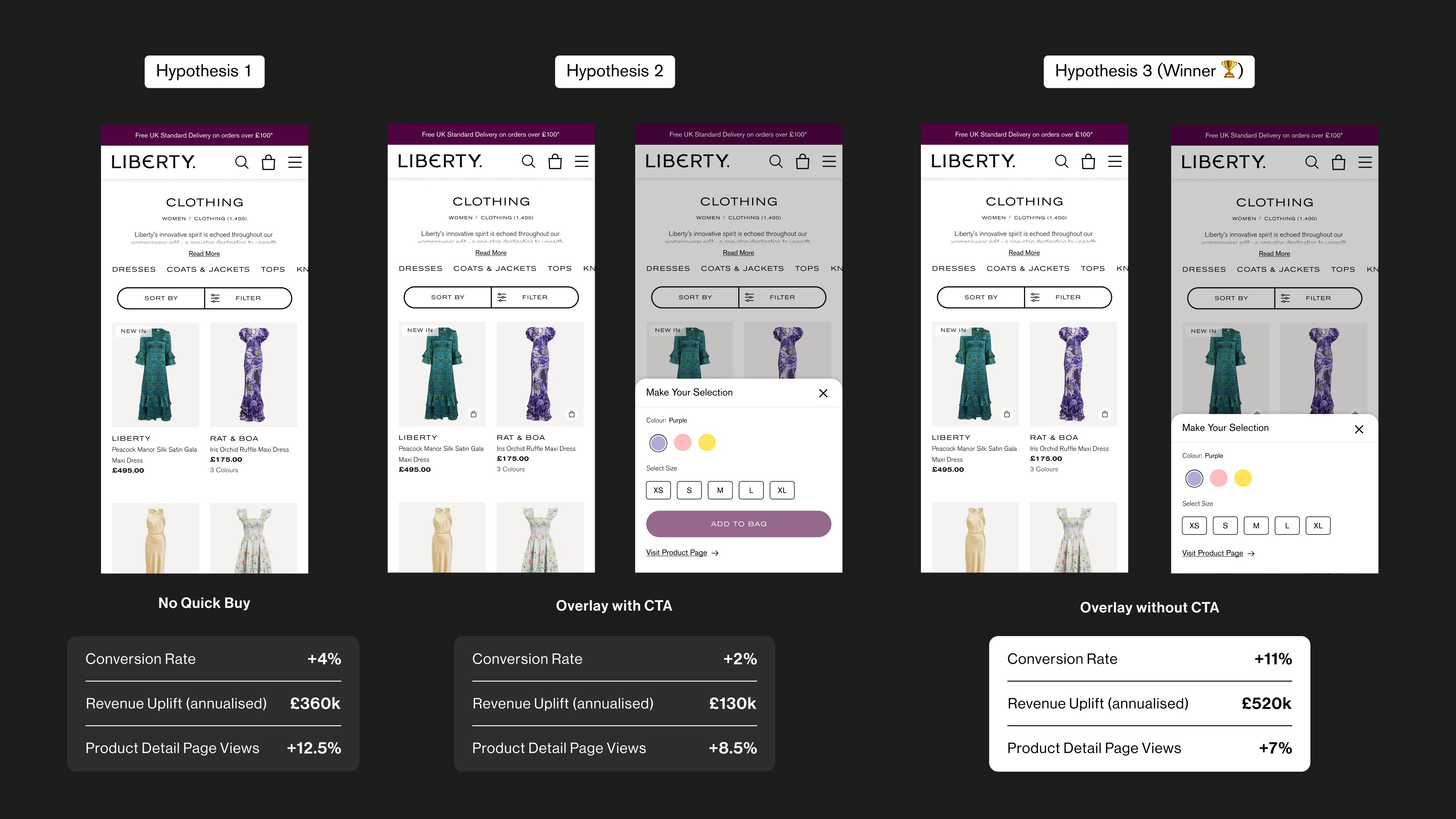
All metrics relative to control group, based on live site traffic.
All metrics relative to control group, based on live site traffic.
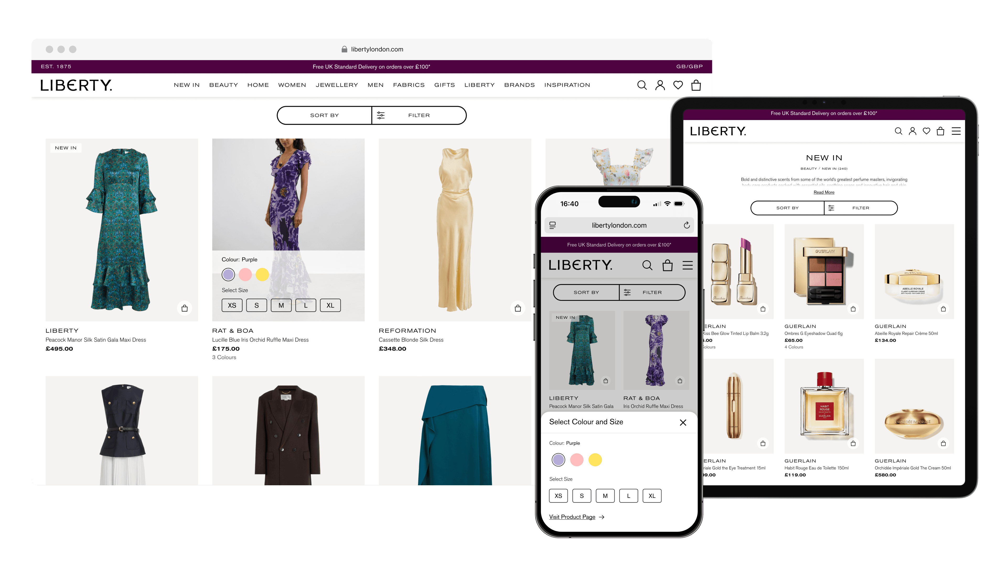
Final Design
The redesigned product tiles and quick buy overlay create a cohesive experience across mobile and desktop, balancing efficiency, clarity, and usability.
Redesigned product listing experience on mobile
Redesigned product listing experience on mobile
Redesigned product listing experience on desktop
Redesigned product listing experience on desktop
Impact
The MVT ran for two weeks, providing sufficient traffic across all variations to reach statistically reliable insights.
Increase in Conversion Rate
11%
Simplified interactions led to more completed purchases.
Estimated Annual Value
£520k
Generated significant growth across the entire site.
Product Detail Page View Uplift
7%
Improved design encouraged more product exploration.
Next Steps
I’d like to explore long term performance of the new tile system, refine micro interactions, and apply the approach across additional page templates.